


I have been procrastinating about creating a portfolio for months now. I keep telling myself that I will create one when I have enough projects to put up but I think at this point that does not matter. I can always work on the projects but it is important to have a portfolio to showcase my work.
This is the first part of my ‘Creating my portfolio’ series and in this part I will be going through the design that I want to implement, my dilemmas around the design and the tools I will be using. I also humbly request everyone who is reading to drop down their suggestions, if you feel like I can tweak or improve certain things in the design and the overall approach please let me know.
With that outta the way, let’s talk about the design
Design
For the layout and use-interface I headed over to dribble for some inspiration and initially I wanted to create a very artsy and colorful website. I really like the GumRoad website and wanted something of that sort. Now before anything else, I would like to mention that I do not enjoy creating figma prototypes, I do understand that they provide guidelines and a solid base for you to work on but I end up working on the prototypes for days on end and that really slows me down.I do want to stick to the conventions and include three main sections:
→ About Me
→ Projects
→ Blogs
Anyways, As I scrolled through dribble I found a bunch of amazing designs and had ideas as to how I could modify them but then I came across; this particular design. I also saw it's implementation here and immediately fell in love.
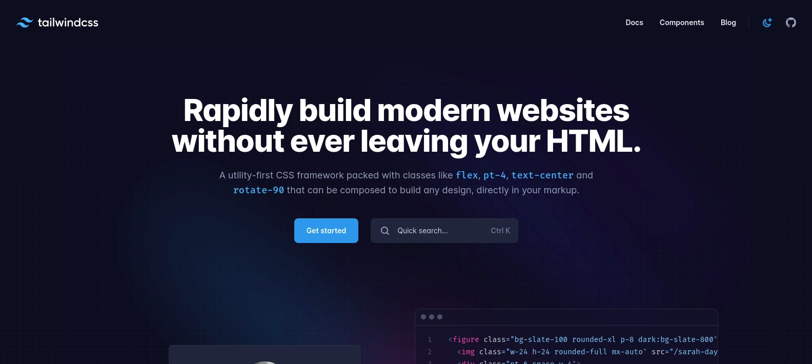
Now I know it is literally the opposite of what I was aiming for, in the beginning but I really really reallllyyy liked the simplicity of this design. I loved how clean yet elegant it looked with just the right amount of content, I knew I wanted something like this but this design was a bit too monochromatic for my liking. I thought of multiple ways I could modify the design and customize it. Here are some of the modifications I have decided to implement.
The background
Lately I have been seeing a really cool gradient effect on websites. I am not sure how to explain it so I will be adding pictures but think of a glowing source of light and imagine looking at it through a glass. This effect can be described as a muffled kind of gradient. I tried to find out what this effect was actually called and I think it is called aurora gradient, sometimes I just think it is a blur gradient so if any of you guys know what it is actually called, do let me know. here are some references:
 The website can be viewed here
 The website can be viewed here
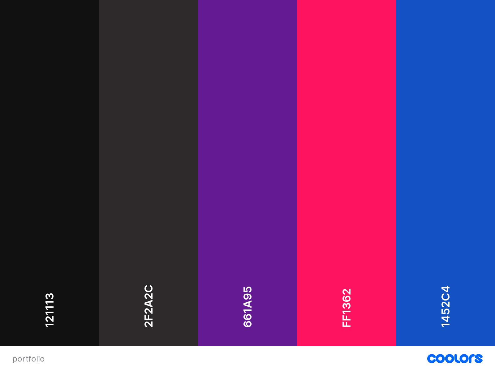
The Color Palette
Even though the design uses only a single color since I am adding a gradient I will use three colors apart from black. I might change the tones a bit according to whatever feels right as I start the development process but more or less these are the colors I will be using:
Additional Components
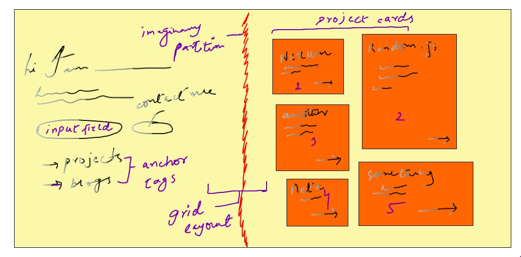
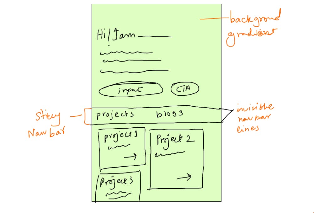
I will also be adding some additional components such as a ‘Contact Me’ Input field. To make it pop out and capture the users attention I will use the same gradient for the button which I will use for the background, and a sticky navigation bar for smaller screens. I may also change the way the individual cards look for the projects and blogs section.
Layout
Let’s talk a little about the layout now.
I already like the layout of the design and do want to keep most of it. For larger screen sizes such as desktops and laptops, I want to keep the layout as it is but I will be changing a few things for smaller screen sizes.
Large Screens
For large screens the main idea is to divide the page into two main section. One holds the general information about the developer and the other one will act as container to show details of the projects and blogs as per the client’s request.
Small Screens
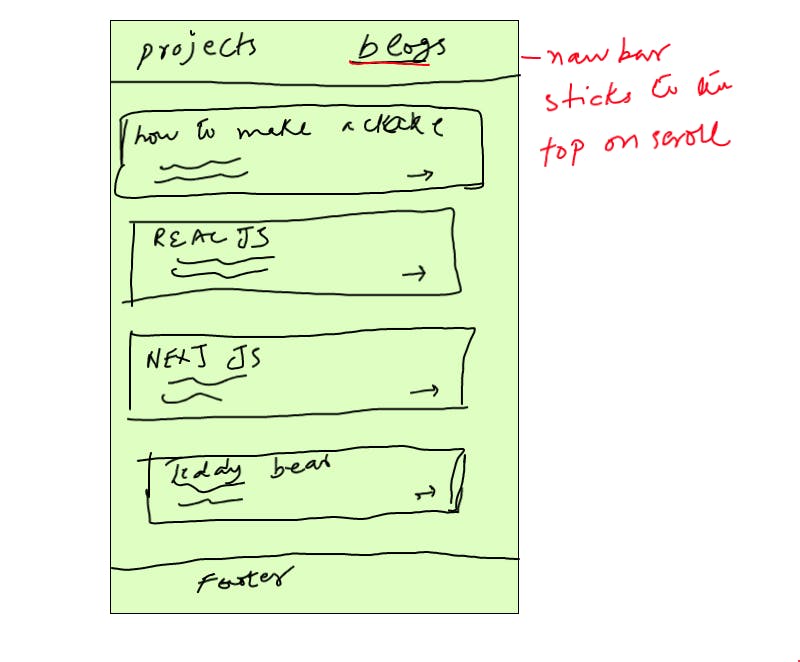
In the reference design, the layout for smaller screens is way too simple. I will be creating a sticky navigation bar that sits right below the initial description section so that when the user scrolls, the nav bar sticks to the top ( not rocket science). Instead of showing the projects and the blogs right after each other, I will allow the user to request each of them through the anchor tags
The TOOLS I WILL BE USING
This is where I am stuck and need help. The design and it’s implementation do not posses any complex functionality. As for now I have planned to use: React JS with Next JS and tailwindcss. BB
I am not sure if this is the right approach because I can also implement all the features using something light weight such as Alpine JS. I do however feel that the speed that Next JS provides is kind of essential for a portfolio website.
Please guide me in the right direction
A little note
Creating a portfolio is something so many people struggle with, mostly because they feel like they are not ready yet. If you are a developer and have been procrastinating, feel free to join me and document your journey as you create your portfolio. You can write blog posts or twitter threads etc to document your progress. If you do decide on joining be sure to tag/mention me so I can take a look at you creations and get inspiration. I am sure there are tons of people out there who would love to see the entire process and this way you will have an incentive too!